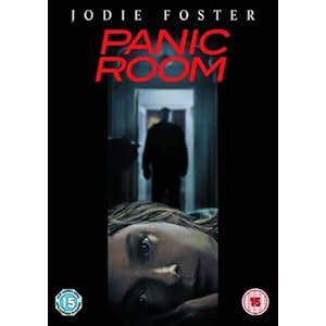
Panic Room

In the opening credits of Panic Room are designed to fit into parts of the buildings and window angles in the city - New York. These huge buildings suggest a lot of power and importance to the credits shown on the larger buildings.
North By Northwest

The opening credits for North By Northwest are a lot simpler. To start with there are just titles sliding into the frame and then off in a white font on a green background. At 0.38 the backrgound changes to a typical American skyscraper building with mirrored windows showing the traffic.
Se7en

In the opening of Se7en, the way the titles aren't on the screen for long and the focus applied mainly towards the filming suggests it's less about the actors and more about the concept of the film. The titles are small and in somebody's handwriting which also takes away the focus from the actors. The credits are in white on a black background - simple.
No comments:
Post a Comment